


TEETER TOTTER, New Brand Development Project
2024
2024
Project Overview
This service is designed to offer tangible assistance to parents juggling work and child-rearing activities. It allows you and your child to encounter diverse cultures through meeting teeters from around the world, providing a chance for children to see language not as a subject of study, but rather as a playful tool for communication within daily life. Additionally, it offers foreigners living in Korea an opportunity to introduce Korean culture.
이 서비스는 일과 육아를 병행하는 부모님들에게 실질적인 도움을 제공하기 위해 기획되었습니다. 세계 여러 나라의 티터들을 만나며, 아이와 함께 다양한 문화를 경험할 수 있는 기회가 됩니다. 언어가 공부의 대상이 아닌, 일상 속 놀이를 통한 소통의 도구라는 것을 아이들이 자연스럽게 느낄 수 있는 경험을 제공합니다. 또한, 한국에 거주하는 외국인에게는 이를 통해 한국 문화를 소개할 수 있는 기회가 됩니다.

Brand Essence
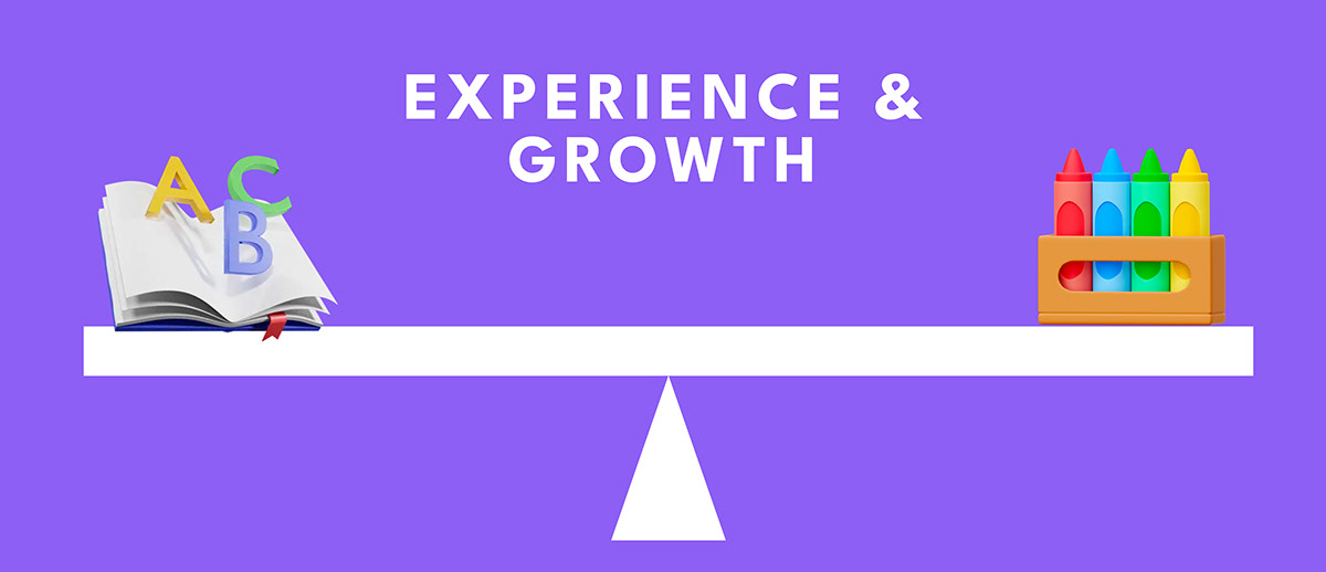
Counterbalance
Even a small weight is essential for finding the final balance, just like a counterbalance. Similarly, TEETER-TOTTER provides practical support for a balanced life, preventing your daily routine from being overly tilted towards parenting alone. Through meetings with foreign caregiving friends, our children are given the chance to encounter English in new and exciting ways, while parents can find a little more breathing space in their daily lives. The counterbalance of life, that's TEETER-TOTTER for you.
비록 작은 무게일지라도 마지막 균형을 맞출 때 필수적인 균형추와 같이, 티터토터는 당신의 일상이 육아에만 지나치게 치우치지 않도록 균형잡힌 일상을 위한 실질적 지원을 제공합니다. 외국인 돌봄 친구와의 만남을 통해, 우리 아이들에게 영어를 만나는 새로운 기회와 경험을 선사하고, 부모님에게는 일상의 여유를 찾을 수 있게 해주는 삶의 counterbalance, 바로 티터토터입니다.


Babysitting in English, a new chapter of childcare.
영어로 아이 돌보기, 새로운 돌봄의 시작


Brand Color
The color of the TEETER-TOTTER is made up of two colors : violet and yellow. Violet means creativity and imagination through various experiences, and Yellow conveys warmth toward children.
티터토터의 브랜드 메인 컬러는 바이올렛과 옐로 두 가지 컬러입니다.
바이올렛 컬러는 다양한 경험을 통한 상상력과 창의력을 의미하며,
옐로는 아이들을 향한 따뜻한 마음을 의미합니다.
바이올렛 컬러는 다양한 경험을 통한 상상력과 창의력을 의미하며,
옐로는 아이들을 향한 따뜻한 마음을 의미합니다.

Typeface
The typeface of the 'TEETER-TOTTER' is a legue spartan with geometric sans-serif from which helps blend in with the self-developed brand logo.
티터토터의 지정 서체는 'league spartan'로서 기하학 형태의 산세리프 서체입니다.
티터토터의 로고의 형태와 잘 어우러질 수 있도록 하였습니다.


Brand Logo / Symbol
In the form of the brand logo, 'T' represents the brand symbol. The form of T shows the form of seesaw, which means the TEETER-TOTTER brand itself.
And the rest of the letter forms were also developed by themselves to show the uniqueness of TEETER-TOTTER.
브랜드 로고는 티터토터의 심벌을 나타내는 'T'의 형태로부터 출발합니다.
'T'는 시소(상호작용)와 저울(균형)의 형태로서 브랜드 티터토터 그 자체를 의미합니다.
그 외 나머지 레터 또한 티터토터만의 유니크한 형태를 개발하였습니다.
'T'는 시소(상호작용)와 저울(균형)의 형태로서 브랜드 티터토터 그 자체를 의미합니다.
그 외 나머지 레터 또한 티터토터만의 유니크한 형태를 개발하였습니다.

Key visual
Key visuals were developed using elements of the brand logo.
The form of the seesaw also means the form of the scale. which is the most balanced.
Also rhythmical when it moved.
The form of the seesaw also means the form of the scale. which is the most balanced.
Also rhythmical when it moved.
티터토터만의 키 비주얼은 브랜드 로고의 형태 그 자체를 활용하였습니다.
시소의 형태는 저울, 즉 균형을 의미하기도 합니다.
또한 다양한 도형들이 움직이면서 역동감과 리듬감을 보여줍니다.
시소의 형태는 저울, 즉 균형을 의미하기도 합니다.
또한 다양한 도형들이 움직이면서 역동감과 리듬감을 보여줍니다.


Icon
The shape of the icon also starts from the geometric shape of the TEETER-TOTTER.
아이콘 또한 티터토터의 로고 형태와 같이 단순하고 기하학적인 형태로 개발하였습니다.

Application
The items below are for children and their Caring friends of TEETER-TOTTER.
아이들과 티터(돌봄친구)를 위한 다양한 어플리케이션입니다.


App
For app icons, used brand gradient background, to show visibility and diversity.

TEETER TOTTER, New Brand Development Project
2024
2024
Client
지구촌 컴퍼니
Brand
Teetertotter.kr
@teeter_totter.official
CBO, Creative director : Bohyun June Kook
Design director, BX Design : Kahyun kim (BE BASED ON BRAND)


